
HeroUI v2.8.0
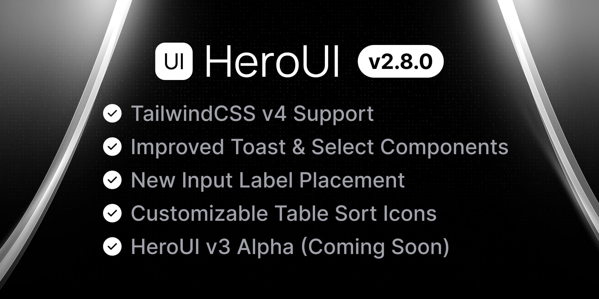
HeroUI version v2.8.0 introduces TailwindCSS v4, improvements and bug fixes.
What's New in v2.8.0?
- TailwindCSS v4 - Support for TailwindCSS and upgrades to various dependencies.
- Overlay Enhancement - Enhanced overlay and outside interactions across multiple components.
- Component Enhancement - Enhanced component capabilities.
- What's Next? - Upcoming features and improvements
- Breaking Changes - Important changes that may affect existing implementations
- Release Changes - Detailed list of features, documentation updates, bug fixes and enhancements
Upgrade today by using one of the following methods:
- Upgrading HeroUI using the
cli
- Upgrading HeroUI using package managers
TailwindCSS v4
HeroUI is now compatible with TailwindCSS v4. With this update, HeroUI CLI has also been enhanced to support initializing new starter templates pre-configured with TailwindCSS v4.
To upgrade your existing projects, please refer to migration guide.
Overlay Enhancement
The handling of overlay and outside interaction for components such as Popover, Modal, Dropdown, Select, and Tooltip have been improved to ensure consistent dismissal behaviour.
Component Enhancement
Toast
- The return type of
addToasthas been changed fromvoidtostringwhere the returned string value is the unique key value of the newly created toast. - A new method
closeToast(key: string): voidhas been introduced to accept a key value ofstringtype and provide a way to close the specific toast with its unique key programmatically. - The Toast closing order has been updated from Last In, First Out (LIFO) to First In, First Out (FIFO).
Input
The Input component now features a new label placement option outside-top. Previously, labels would always remain inside the input field if there was no placeholder.
The new outside-top option ensures that labels are consistently displayed at the top of the input field, regardless of whether a placeholder is present, similar to the existing outside-left placement.
Select
Two new properties isClearable and onClear have been introduced in the Select component. A clear button is visible when a value is slected and a callback function triggered upon clearing the selection for custom handling.
endContent has been introduced in the Select component.
Table
The table header previously utilized either a chevron-up or chevron-down icon for sorting, which was not configurable. A new sortIcon property has been introduced, allowing users to customize the default sort icon. This icon will only be applied when allowsSorting is set to true.
Slider
The getTooltipValue property has been introduced to customize the content displayed in the tooltip by returning a string or a number from the function. The existing tooltipValueFormatOptions prop can be used for additional formatting when number is returned. If tooltipProps.content is set, it will take precedence over the value generated by getTooltipValue.
What's Next?
We're excited to share that HeroUI v3 (Alpha) is just around the corner! You are expected to create stunning interfaces with 50% smaller bundle size, lightning-fast native CSS animations, and effortless customization that adapts to your design vision.
As an Alpha version, we're actively gathering feedback and refining the current components, including Button, Accordion, Avatar, TextArea, Checkbox, and more. Your input is invaluable in shaping the future of the library.
Breaking Changes
- The component style have been updated to align TailwindCSS v4.
loadingIconnow renames toloadingComponentin Toast component
Release Changes
As always, we are incredibly grateful for your continued support and contributions. There are many exciting milestones ahead, and we invite you to join us on this journey.
Special thanks to HeroUI Team members @winchesHe, @macci001, @Vishvsalvi, and contributors for their contributions to this release.
Thanks for reading and happy coding! 🚀
Community
We're excited to see the community adopt HeroUI, raise issues, and provide feedback. Whether it's a feature request, bug report, or a project to showcase, please get involved!
Contributing
PRs on HeroUI are always welcome, please see our contribution guidelines to learn how you can contribute to this project.

